Monday, December 31, 2012

Pixlr Software Continued

Monday, December 31, 2012


Pixlr Software
Continued

    I did a fast search, and it turns out that Pixlr is owned by Autodesk. There is the site for Pixlr where there are tutorials, community groups and so forth. This certainly makes it easier if you need any help. What's also interesting that I mentioned yesterday, is that the program resides on the Pixlr website. Now I also understand how Adobe's "Cloud" system works. I did the usual modifications in Pixlr, but for today, I simply will show you examples of what the program can do to your images. These are mostly image chafes or variations on a theme, but the images certainly can be interesting for young people who like to e-mail their friends every hour.

The Starting Image
A Pair of 1950's   Hubley Diecast  Steamrollers

Halo Effect 
I repeated the command 2 times to get to this point

An effect called "Heat Map" 

Art Poster

The Old Photo Command

 The result of the Old Photo Command

A "Sponge" Effect
I didn't get it to work the way I wanted, but it appears to remove colour or add colour.


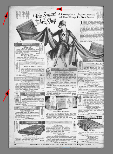
Here's an example of a 1927 Montgomery-Ward Catalogue page
It's yellow  from being 85 years old

Adjustments >> Hue and Saturation

I removed the discolouration through a -100 saturation (desaturation)

Using Curves to return the contrast to a nice level.


   So what's the verdict? A great program, that's free! It's easy to use, there is a resource site if you need to understand how something works, and the program resides on the company's site, so you don't have to have your tablet or smartphone loaded with the program.  I don't know how fast or slow it works with a smart phone. I asked my wife to have a look at the program as she has an IPhone, so when she does try out the program I'll let you know.

    Today's the last day of the year, so I'd like to wish everyone a Healthy and Happy New Year.

Thanks for dropping by,
and as usual, have a great part of the day, 
wherever you may be.

Stacey


Sunday, December 30, 2012

A Photo Editor by Pixlr.com - WOW!

Sunday, December 30, 2012


A Photo Editor by Pixlr.com
Wow!

     I've been getting better from my  bout with a cold or flu, so I've been able to actually sit down for more than 20 minutes and not feel antsy. About an hour ago, I decided to do a search for "image-editing soft where", when  Editor by Pixlr.com shows up as 1 of the results. So I think to myself "lets' give this one a try!"

   What I discovered is that this is a free (don't quote me on this) software that you use on-line. I think it's ,made more for mobile devices that my iMac, but am I impressed! I had a small problem with the software so I dded that to their community forum, but I did ask the question as to why this software is free?

    If you are familiar with the #1 software, then you'll have no problems using this software. And if you've never used a higher-enbd image-editing software, I think you'll quickly begin to understand
how to use it. I don't see cellphone users and IPad users spending 30 minutes to edit a photo,but maybe I'm wrong, and there is a market for such sophisticated software. 

   Pixlr.com also has several other softwares,but I'm only going to write about Editor today.


The Company's Logo

(Please click on the above link to be redirected to their website)

Going to the Pixlr site has you arrive at this window.
There are 3 options of image-editing.

I'm writing abou the advannced one called Editor.

This is what you get when yo uarrive at their site

The Drop-down menu for edit.

Notice that it's quite sophisticated, and has the 
feel of the higher-end image-editing software companies.

The Gradient Window

For those who don't know, a gradient is simply a change on intensity (light to dark or vice-versa) or change of colours from top-to-bottom, or side to side.


I kept accidently going to the Safari menu and going file >>open or Edit, 
when I wanted to go to the Editor software.

It's a small issue that I easily overcame to work with Editor.

The Adjustment Menu and Sub-menus
It's very "sophisticated"!

The Filter Menu and sub-menus
Are there enough choices for you?


I used a water bucket to add the mauve colour to the car foundation.
I also decided to test out the text. You have a nice selection of fonts, and the usual size and colours.
YOu type toyr text in the white rectangular space, and it appears on the image in the blue rectangle, just to the left corner where the word "test" appears.

You also have the option of many different languages, which I didn't check out.

When you add text, you are adding it to what is called a "layer".
A layer is like a piece of tracing paper. Each time you work with an image, there is always a layer or there should be. In this way, you never work with the original image.

At the end of your work (in this case the text), 
what you want to do is have the text attach to the photo layer.
To do this you flatten the image.

I especially like the use of the blue background to highlight the sub-menu.


   It's coincidental that just the other day, I was thinking "how come there aren't sophisticated photo editing software for IPads and IPhones, and then, I discover Editor by Pixlr.com. Just on Friday, my favourite morning coffee spot - Dunkin Donuts was closing down the next day. I saw someone I know taking a few photos with his cellphone as mementos, so I asked him to forward them to me.  Needless to say, they needed some work . 

   With a program like this, people can now take photos and edit them to a new standard of quality. Of course I can also see 2 things happening, 1 of which seems to already have happened.  I will be able to use my DSLR Canon to talk to people, and Cellphones will become highly-sophisticated cameras!  By the way, the first "idea" of mine is partly true. If you look at the latest Nikon ads with 
Ashton Kutcher, that camera transmit photos to your cellphone.  The question for me is what have the cellphone? Just put the cellphone into the camera,or the higher-end camera into the cellphone!

    I will probably will another post about this software, but I hope tht you'll find this site, and realize what a great program this software is!

Thanks for dropping by.
and have a great part of the day, wherever you may be.

Stacey


Saturday, December 29, 2012

Puppet Warp in Photoshop

Saturday, December 29, 2012


Puppet Warp in Photoshop

Background

    Puppet Warp in Photoshop is an interesting "effect"  allowing you to stretch, turn or bend a part of your photo or the whole photo. However, you can only work it well with a subject that is not on a foundation or background. So you' would need to extract the item, work with it by itself, then plae it back on its original background or a new one.

A Pacific Sunfish caught and mounted on a West Coast British Colombia Fishing Resort  

As always, duplicate or re-name the file.
You never want to use your original image.

The Puppet Warp is under the "Content-Aware Scale"
However, it's light grey, meaning that you can't command this command.

You have 2 options:

1.  Duplicate a layer
2. Double-click on the right layer menu to unlock the background layer

 A background copy layer was created

 Creating the background copy layer, now allows for the Puppet Warp control to be activated.
Notice that the colour of the words  had changed from light grey to black.

With the tool activated,  you now have a "push pin" icon.
It's quite simple. 
You add push pins to hold a part of the photo, 
and place other pins on the opposite side. 
From the opposite side, you then change to the drag icon and pull.

You'lluse the top icon (arrow head icon with Iron Cross) to pull from 1 side.

Now you can see why I said that you have to work with an image without a background! 

1. The background layer is not moving, while the top layer is changing and rotating!
2. Look at the lower tail part of the fish. It's distorted. You have to be careful where you plave the push pin.

Notice the distortion of the fabric in back of the fish - ergo,you can only use an image without a background (one with the checkerboard).

I've flattened the image to save it, but notice that the misalignment of the 2 layers still persists!

 Here, I decided to attack the above problem of misaligned layers, buy working only with 1 layer.

I did everything as before, then  applied the Puppet Warp.
Since I only had to work with 1 layer, I didn't worry about the misalignment issue.

You can see the checkerboard in the background.

However, the front layer now can rotate without the worry of the background layer.

You can always crop away the excess undesirable areas.

I did a bit more warping to show you how you can distort the fish.
You can have many points, and even a map of warp points, but like all of my first 100 posts, 
I'll follow the KISS principle: "Keep It Simple Stupid"
It's an expression that means to begin easy and elaborate later once you know what you're doing.

That's it for today.
I haven't been writing any posts lately, as I had the flu for 5 days, and the week before my wife was sick.
Lucky for me, I got my flu shot this season!


Have a great part of 
the day, wherever you are.

Stacey


Wednesday, December 26, 2012

Scanning Old Documents

Wednesday, December 26, 2012


Scanning Old Documents
(and cleaning them up)


    I have another blog that I write about old toys. A few months ago, I had seem some old catalogue photos of old toys, and so I jut had to have one of those old catalogues for myself. My idea would be to match up old catalogue photos with old toys that are still around.

   People on the Net are quite nice, and so Before I had my old catalogue, I asked someone if I could use they old photos,and they said yes, right away. Naturally, when I got my catalogue, I asked the person from whom I had used his photos if he'd like a copy of mine, and he said yes. Also,he had a great idea that I didn't think of - send a DVD of the catalogue.  As if I thought I'd send 530 pages over the net as e-mail attachments! Sometimes, I just don't think!

   The Catalogue is a 1926-1927 Montgomery-Ward catalogue from the US. You need to understand the history of the US at that time. Most of the country was more rural (country) that urban (city). The "automobile" had been around for about 2 decades, but there were very few roads. Also, the same could be said for trucks. Furthermore, the great country between the Pacific and Atlantic was being expanded, and the railroad was the sole means of shipment.


     The size of this catalogue is 13 1/4" (H) x 9 1/2" (W) or 337mm x 242 mm). I couldn't scan this on my Epson V700 because I'd have to scan it 2 times, since the scanning surface is not that big. I used my wife's Brother all-in-one multifunction machine (printer, scanner, fax, and copier) and that was good enough! It scans at 300 dpi (Pixels/inch) and you don't need any larger.  Most of the catalogue is in B & W with hand drawings, and type.So I'm dealing with lines and you don't need to scan at a higher resolution. Furthermore, the type would start to look too "weird" at high resolution!

     There is a problem though with old documents - they dry out, and change colour. 


You can forget the "regular" colour correcting in Photoshop.
It doesn't work! However, I did figure out a way to clean up the old pages.

The first thing to do is to change the image frpm RGB Color to Grayscale.
It's easier to modify tones in B & W than in colour.

Photoshop will ask you if you want to discard the colour information, and you'll say "discard". After all, the colour is from the aging of the 84 year old catalogue.

You can now easily see how "easy" it will be to work in B & W). The arrows are pointing to the aging areas of the page.

I'll use the rubber stamp set to soft. As well, I'll set the opacity to 76%. 
If you set the opacity (covering power) higher, then the rubber stamp may start to apply darker tones to the areas needing work.

The grey-toned arrow is pointing to a part of the page
that I guess was not completley flattend on the scanner glass surface.

I selected just that area, and then did a "smart sharpen".
Once again, you'll find that Photoshop does not work well here, so the smart sharpen is the best that can be done!

Now here's where I figured out what to do with the page, to bring back some colour to it. Adding colour would give the page an "aged appearance". RGB is the "usual" color choice.

I'll open the Color Balance window.


I like sepia-tones (what I have below).
However, I could just as easily added the original brownish-yellow tone.

Sepia is a colour made up of red and yellow, with more red than yellow.


The final result.

    While I was scanning these large-sized pages, I decided to check out what sources there are for scanning very large-sized documents or art work. I was very surprised to see that the industry is alive and well with museum scanner, document scanners, and so forth.These scanners can scan huge painting or documents. Of course, just like the scan on this page, you don't need to scan at 1200 dpi to get nice results, You have to remember that the larger an image or document, the farther away that you will be viewing it.

So, I'm sure most of you are busy running aroung looking for bargains on boxing day, so good luck with your quest.

Stacey