Monday, November 28, 2011

Colour and Exposure Accuracy in Digital Photography

Monday, November 28, 2011

Colour and Exposure Accuracy in Digital Photography

     One of Heidi and I's friends came over today for a short visit. Peggy-Anne and her Husband Glenn are architects, and Peggy-Anne has become a super artist. They say that one should change your profession 5 x during your lifetime. I have trouble with 1! Heidi, Peggy-Anne, and myself were talking and  Peggy-Anne said that she's arranged with a company to sell her beautiful artwork. Peggy-Anne   started to talk about accuracy in reproducing colour, and the next thing I knew, I was talking to her about about colour charts and gray scales.  Of course, if she started to talk architectural language, I would have trouble understanding. So I got one of those "Eureka moments", and I therefore said, that I'd simply write an instalment about this on my blog.

    I also received a new group of nice toys from someone in Maine (Larry Jacques) whom I'm trying to coax into writing an instalment. He also restores toys, and his batch of toys were used today for thios instalment. Thanks Larry!

    In the BDE (Before Digital Era), you had to have certain films to match the light that you were working with. They only made daylight and tungsten films. You used daylight for outdoors, and tungsten for most warm-light (lightbulbs) photos. There were also a range of colour filters to get accurate colour.  I don't want to go too much into detail, but here's an example when having used slide film. Unlike negative film where you could "correct colour" in the darkroom or at your favourite photo store or lab, slides recorded the image and you couldn't do any changing. Daylight slide film was fine for shooting between 10:00 - 4:00 P.M. on a bright sunny day. However on an overcast (cloudy day), you'd end up with blue-coloured slides. What you had to do is place a warming filter over the lens which was reddish in colour.

  Today in the DE (Digital era), you simply choose the white-balance on your camera to match the light source that you are photographing under. There are also special  colour charts and gray-shaded charts to use for accuracy when you need it. You can use Photoshop to adjust colour based on Photoshop readings of the colour or gray charts.

  One of the more popular and successful companies is X-Rite, which produces the Macbeth line of these special calibration charts.


 Here is the ColorChecker Brohcure and Instructions


 # 19 is white and is used to check for colour accuracy and calibration.

 Here are the chart values

Here are the exact values for this # 19 white tone

To explain colour in photography, you need to know that white is made up of equal colour values  or quantities of  RGB (Red, Green, Blue). The "opposite colours" are CMY (Cyan Magenta and Yellow).

In a perfect setting ,the values would be equal. However, if your lightbulb is older, or you're in a green-walled room, the ideal world is gone right away!

An ideal set of values for white are 
R 243
G 243
B 242 
(* I don't know why B is 1 # less)

In a green walled room, your numbers might be:

R 200
G 250
B 200

There is more green hence the higher number.
You find these numerical values in Photoshop, which I'll explain below.

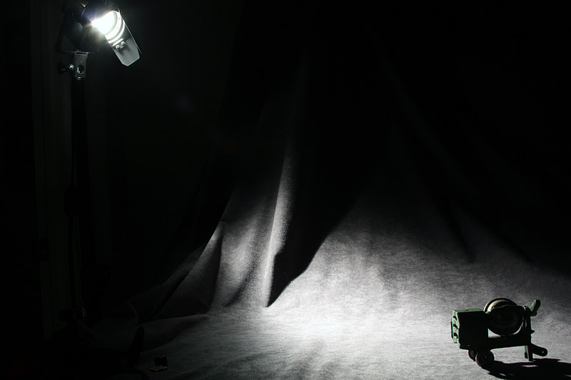
Before you adjust the colour, you need to determine accurate exposure.
Above are a range of underexposed and overexposed test photos.

I should have placed the colour chart in there, and then read the
# 22 gray value in Photoshop.
Gray is used as a reference as it has no colour in it).

Here's the X-Rite ColorChecker, with only 3 exposures.

Here's the X-Rite White-Balance Card with only 3 exposures.

Here's the X-Rite Gray Scale Balance Card

All 3 can be used together, or you can purchase just one.
Any of them will give you numerical values to change (if needed) in Photoshop or any other image-editing software to obtain more accurate values and colour.

The item above is called an "eyedropper".
It is used to measure colour in a photo in Photoshop


In the upper right corner of Photoshop is the colour centre.
looking at the numbers and comparing them to the X-Rite values,
shows you that in my photo,
I have more red and magenta than blue.
If I remove quantities of these, then the photo won't be so "reddish".

 I changed the values elsewhere in Photoshop, and the above is what I got.
Notice that the background is not as red as before.

You can go to the X-rite Photo site to get more information and assistance.


I used the eyedropper to get a reading of the gray shade.

Here are the gray values.
The 3 values are certainly almost equal, so the grey will appear grey.


Here's the values for white and they certainly are within what they should be.

My problem is that my fabric that I use to photography my toys is reddish.
Even though the X-Rite reads accurately when I corrected my numbers in Photoshop, the fabric is
not a pure grey.

So I'll have to live with that or get another fabric.

I'll be coming back to expand on this instalment, but for now, let me review.

1. There are special "targets" that can be added to a photo in order to  get accurate colour.

2. These targets have specific numerical values.

3. These values can be read in most image-editing software programs.

4. White values are high as they reflect more light to the camera (250-250-250).

5. A mid-grey value is best for determining accurate exposure. Its' value is 160-160-160.
I got these numbers in the image above called "chart values).

6.  A black value is the lowest of all and reads 52-52-52.

7. If your numbers are "off", then you know that the true photo colour is inaccurate.
If it read, lets' say 270-250-250 for "white,then you'd know there is too much red in the photo.

You would have to subtract 20 units to get the accurate colour and numerical values.


To Be Continued........


Thursday, November 24, 2011

The Scanner

Friday, November 25, 2011

The Scanner

     I can't remember the impetus for me to write about this topic today, but it will grab your attention. I wrote an instalment way back about copying slides. I started with the scanner, and then figured out a way to copy them with my camera. That was faster and gave a good-enough quality for my clients. I proved them with 4" x 6" @ 300 dpi and  a lager size for making 10" x 12" @ 300 dpi. "DPI" stands for dots per inch. That size is good enough for making prints, as the human eye cannot resolve anything finer.

     I decided for this instalment to write about scanning a negative. By the time I finished selecting my photos for this instalment, it made me realize what the digital era has done to photography. My analogy would be similar to the car and horse, or the airplane and travel. It certainly was a giant step!

   So without further "chatter", here we go.

   The negatives below are  some of the remaining film that I was able to salvage after a "flood of the century" ruined my basement,  Hasselbad equipment, a few canon cameras, and about 5000 slides and negatives!

  The moral of that story is: Always keep your film or digital material in a secure and dry place if ever.....

  I purchased a Nikon 8000 film scanner a few years ago to transfer all of my slides (that I still had) to digital media. After a couple of hours, I realized that that to do what I wanted to do would take months and months of 20 hour weeks. I decided to sell the scanner, and I left the slides in their trays. By the way, the Nikon 8000 is 1 generation prior to the release of the Nikon 9000. Save yourself thousands, and if you ever get your hands on a Nikon 8000 dedicated film scanner, go for it. There is the Imacon scanner, but they're "sparse" on E-Bay and on a good day with run you about $ 3500.00- $4500.00 U.S.

     When the Epson V700 and V750 came out, I read the reviews and decided to buy one on E-Bay. It's great, but I would save it for super-quality work if someone needed a 16" x 20" (40 cm x 50 cm) @ 300 dpi. or larger print to be made from a 35mm negative. For "average" work, simply refer to my instalment on using your camera to copy slides or negatives.


The Epson V700 comes with all sizes of film holders.
The above is for 2 1/4" x 2 1/4" ( 6cm x 6cm ).

The Epson Software is adequate, since you can work in Photoshop.
Above are 2 windows/menus for adjusting some of the characteristics of the film scan.

I have a problem of not being able to get the plug-in of Epson scanning into Photoshop.
If anyone reads this, please drop me a line. For now, I just scan with Epson, save the file to my desktop, and then open the image in Photoshop.

If you are into serious scanning, the Silverfast is "the software" to buy.


This is the scan result.
The "eyedropper" is used to adjust the colour, density and contrast (please see below).

With a software like Silverfast, you'll be given a list of default film choices to zero on on a very 
good-excellent result. Epson, simple has the options of scanning negative, slide (positive) or reflective (page or photo).


Some adjustments that I made are shown above.

Here is the result which is a better-working start in Photoshop

Here's the data of the scan.
It's certainly more than adequate to work with.

The file saved to my desktop, for later work in Photoshop.
I saved the scan to my desktop.


Photoshop
Step 1: Adjust the intensity of the sky.
I purposely  did a "poor" selection to better show you the results.

I adjusted the sky, then I did an "inverse selection" to adjust the ground.

Step 2: Automatic Color in Photoshop


Step 3:
Bring out better detail in the lower portions of the image.

This is how the image looked before the above corrections.


Lots of repair work to do from what I considered a salvageable  negative from that 1986 flood.


Selecting the sky for improvement

Inverting the selection to work on the "bottom portion".

Step 4
IMprovement on the lower portion of the image.
The Improvement

A portion of the image.
I forgot to place the emulsion of the negative towards the Epson's negative scanner reader.
On these desktop scanners, you have a dual feature for scanning:
1. Film
2. Reflective material such as a photograph, magazine cutout, etc...


Step 5:
Flip the image (Horizontal flip command in Photoshop)


Step 6: 
Resize the image and save it with another title such as "smaller Vermont Town Scene"

Step 7:
This is the horse era moving into the car era.
Clean up the town to look like it did before electricity!
Remove the cars, the wires, the electrical pole the lawn stakes, etc....

This is done with what Photoshop calls "content aware"
You delete a selection (Shift Delete) and then bring up 
"content aware". What content aware "tries" to do is remove the "strange item in the photo (the wires) and replae it with surrounding material.

This doesn't always work, so it's better to start with smaller selections than larger ones. 
That works better! I'm sure Photoshop Cs7 or 8 will improve that!


The content-aware window

Better to work with small parts of the scene than larger parts. 
the reason is that Photoshop tries to select surrounding areas to blend in with what you want to remove.

I wanted to remove those grren stakes in the ground

This is what Photoshop's content aware wanted to give me!


Step 8:
I removed the car the old-fashioned way, with the rubber stamp.

The car was removed, along with the telephone and wire pole.


A before and after close-cropped comparison.
What would we do without the DE (digital era)?

The Philosophical "Stuff"

It's easy for most of the younger generation (I'm young at heart!) to have slipped into the Digital Era quite easily, and take for granted what us older people (I'll be 63 on Tuesday, November 29th) have seen change. Having taught pro photography, I naturally had to adapt. For some people the change sure must be shocking. There was a small article in the news the other day. A 2 year old baby was trying to move images in a glossy-paged book sideways - she thought it was an I-Phone! She got extremely agitated and upset, not understanding what a book was or having been confused!

Times certainly have changed!


Photography Tabletop Lighting Revisited

Thursday November 24, 2011


Photography Tabletop Lighting Revisited

     When I taught professional photography, few students after 3 years presented portfolios on tabletop photography. Granted, this area is not for everyone, but because this area is relatively "quiet" and non-personal, most students sought the realm of people-oriented (portrait, fashion, documentary). However. there was plenty, if not more opportunity in tabletop and commercial product photography. However, I had to respect their wishes.

     The second observation after the above comment, is that most people can easily spot a nice tabletop, but think they can't reproduce it. Wrong, wrong, and wrong.  I used to emphasize to no end, that it's the lighting of a photograph that provides one of the key elements to the "shot".

    This small Hubley cast iron cement mixer arrived today, and I photographed it. I'll be saving it for those free 50 listings at either the end of November or at the beginning of December. 

   Below is a step-by-step explanation of how I got the final image for E-Bay.

  The Fnished  Hubley Cast Iron Cement Mixer 
for E-Bay December 1, 2011

  Image 1
This is called the main light or establishing light.
This lights creates the mood, or in this case a 3D effect. 


  The main light is high and to the left

  Image 2:

This light is called the fill light.
It provides illumination into the shadow areas.
It's important to place it in a position where it will NOT cast a second shadow or
have the shadow be strong!
We live on a planet with 1 sun which casts 1 shadow, so 
photographers try to keep this simple "law" in the studio.

  Oh, oh!
Notice the 2 shadows! 
A Big mistake!
But when I frame the image tight, the 2 shadows are a smaller "error".

Image 3:
This light (in this case, a silver reflector) is called a "kicker" or "accent" light.
In the tabletop photo above, it's adding an extra "highlight" 
to the left grillwork side of the cement mixer.


You need supports for these reflectors, so I usually grab whatever is at hand.
However, the best thing is blocks of wood.
All you have to do is go to the local hardware store or lumber yard and ask for waste or scrap pieces!

Image   3:
Another "kicker" or "accent" light was used.
It's providing more light to the dark shadows areas, as well as adding some more highlights.

Something to note here is that I used  a long focal length lens or a zoom lens at its' longest focal length.
This does 2 things:

1. Avoids distortion (altering the actual dimensions of the item)
2. Allows you to come in close and eliminate the distractions, which in this case are the reflectors and their supports.

Another mistake or rule that I broke - Never hand-hold a reflector or light.
The reason for having a clamp with a stick hold the reflector is that:

1. It frees toy from accidently creating and shake of the table
2. You can always get the exact same result!

The exposure was for only 1.3 " (seconds) @ f 16, but look at how much my hand shook, even though I tried to hold the reflector still.


An obvious question that you most likely have is this:

"Where did I get those reflectors?"

I like smoked salmon (lox), and the slices of smokes salmon come with the "free reflector".

However:

1. Use Alcoa aluminum foil and glue it to corrugated cardboard.

2. Go to almost any graphic design store or art supply store and see if they have sheets of shiny silver in 32" x 40" sizes.
Buy some "foamcore" (foam in the middle and outsides are white). 
This is excellent for gluing the shiny silver sheets to it. However, this is expensive.
Better to stick with the the first choice (make it yourself with readily available materials).


  In the future, I'll be continuing with lighting, because as I said, lighting is one of the most important elements to any photograph.