Tuesday, November 22, 2011


Image-Editing Software:
The Histogram
I thought that I'd start to explain about the different parts of every image-editing software, so you could better and easier understand the term. I'm going to start with the histogram. A histogram is a graph-like presentation of how the different shades/tones/colours are proportioned in a photo. THis sounds complicated, but you'll get to understand this, once I show you some photos.

Placement of the Tones
Left side: Dark tones (shades)
Middle: (middle tones)
Right side (Light tones (shades)

This histogram shows that:
1. There are lots of dark tones
2. Lots of light tones
3. Not too many mid-tones

This histogram shows that:
1. There are all kinds of tonal distribution, but mostly
2. Lots of midtones
3. Some light tones
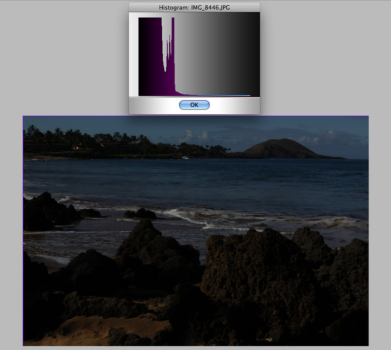
This histogram shows that:
1. There are mostly very dark tones
2. Hardly any mid-tones
3. No highlights
* The vertical levels simply indicate the quantity of the toones
while the left to right spread (horizontal) indicates the actual tones
(Black-greys-whites and eerything in-between)

To correct "problems" that are shown by the histogram,
you can use the "levels" menu.
This menu also has a graph to show you the distribution of tones.
The left and right sides and arrows are the same as with the histogram.
Left = black
middle = mid-tones
Right = white

You simply slide the pointers or arrow heads in the top "input levels"
to change the image tones.
Of course, you can alter the numbers, once you understand the numerical system.
I changed the "arrows" and improved the photo.
However, as you can see, there are not enough quantities of tones (vertical axis) in the graph.

I worked with the arrows/sliders and got the above.
The photo lacks enough contrast, but the tonal distribution
is much better in terms of quantity.

I was working with the program Compositor,
so I don;t have full mastery (understanding) of the program.
I decided the select the highlight areas with the lasso,
and then lower their exposure (make them darker).

This made the histogram more like a rounded hill.
The "rounded hill" shape is best.
When the quantities appear to hit the top of the rectangle, that indicates that their more than you need of them.
You want the quantities to go below the top!

More adjustments (darker) have
let to a better "rounded hill".

The Invert Selection command simply changes what was selected.
Before I selected the lighter tones (sky and water).
With the Invert Selection command, I've now selected
the land areas.

The histogram hasen't changed much, but there is better detail in the shadows (dark areas).
So the question you're probably asking is why bother with e histogram, when you can simply work with the menus such as:
Levels
Highlights/Shadows
Curves
Exposure
The answer is that it's a tool amongst many others to assist you in improving your image.
Here's an analogy that perhaps can explain the "why".
An experienced car mechanic can tune a car by experience and feeling without using machines to show him/her a visual "picture" of the tuning.
Of course, the "picture" is the oscilloscope (or whatever the tuner is called) and this is like the "histogram" in an image-eiditing software.
Eventually you don;t need the "picture", but it helps at the beginning, especially when it comes to "hitting the ceiling" with the tones.
As usual, I welcome any comments or corrections or suggestions.
So if you don't understand something, or I erred, please inform me, and I'll correct or alter the instalment writing to better clarify the topic.
SB
No comments:
Post a Comment