August 28, 2011
Canon ImageBrowser Software Part 2
I like to take present small steps when I'm writing about anything. Some students used to say I was making things too complicated, while others felt that my writing had helped them a lot. I would rather oversimplify, than have some people or students not understand.
I'm going to do 2 sections here:
Section 1: A detailed step-by-step of 2 actions from the edit menu
Section 2: A before and after comparison with a written list of what was done
So, here goes......
1. Bring down the Edit Menu
2. Remove the Red Colour by moving the slider to the left
Here's how the image looks with the red removed.
The image is still too dark!
4. Bring down the Level Adjustment
This action will adjust are that are:
1. Too dark
2. Too Bright
3. Not enough spread of tones
5. Lighten the image by moving the middle slider to the left
6. It's lighter, but now I made it have less contrast!
I can always cancel what I did and choose another action
or
continue
I choose continue.......
7. I'll try "Tone Curve Adjustment"
This will adjust the contrast
7. Here's the window capture to show you the difference
8. Here's the final "improved image".
I still don't like it - it's too "milky and lacks contrast!
Here's what we started with
10. Result with Just Levels
That's about as good as I can get it.
I don't want to use Photoshop to compare, because not everyone had Photoshop!
Now let's see just show the before and after and include what was done to the images......
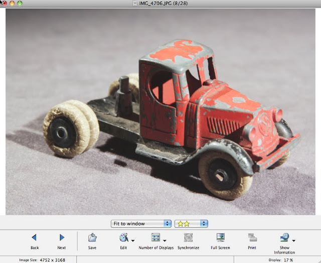
1. Colour is "off"
2. Contrast is Low
1. Chose Edit >> Auto Adjustment (fixed the colour)
2. Increase Brightness and Saturation
I thought I'd change topics
(Montreal West, Quebec, Canada -City Hall)
1. Too Dark
1. Colour-Brightness Adjustment
(Only Brightness)
2. Then adjusted Curves
(To Lower Contrast a bit)

August 2010 - My Niece Carly Got Married to Rob in Hawaii
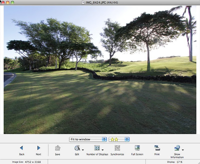
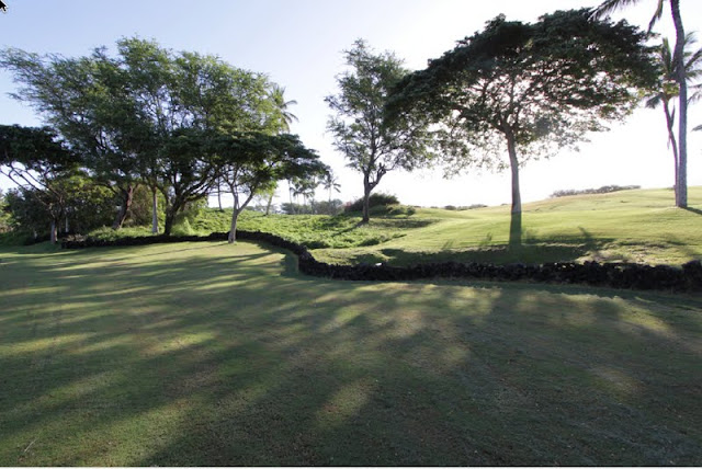
1. Road in Photo - the scene is a golf course
I was interested in the trees

1. I got rid of the road in order to make the image more rural
2. The lawnmower tracks in the foreground still make the image look too urban
1. I increased the darkness by going with the Tone Level Adjustment
I moved the middle small triangular pointer to the right to darken the overall image, which at the same time reduded the number of middle shades (tones)
I decided to darken the image by going with the Curve Function
I could have tried the Brightness function and darkened the image that way
If some other combination works, then try it.
Just remember not to save the image if it's no good!
Also, always have a duplicate set of photos on an external hard drive as backup!


Excellent, this has given me the impetous to try editing some of my Meccano collection photos with the editing s/w provided with our point and shoot camera.
ReplyDeleteRe: your comments above on presenting information...this reader likes the oversimplify approach....!
Thanks again, great articles.