Wednesday, August 31, 2011

The Panoramic Photo - Stitching Software - Part 1

August 31, 2011
The Panoramic Photo
Stitching Software
(Part 1)

    A panoramic image is one that captures a view wide area. Before the digital era, there were special film cameras that were capable of capturing a very wide area. Hasselblad made a special camera that was 
70 mm x 24 mm and used 35mm film. It was able to expose film 2x the normal film format. When I went to camp 1 year in the mid 1960's, there was a special camera for photographing all of the camp kids. THe 4000 kids and staff were positioned in a wide area. The camera exposed the film "differently". It had a small vertical slit that exposed a part of the film, as the camera turned about 210 degrees. As the camera turned, the slit exposed a small part of the film. Simultaneously, the film also moved, to allow for different parts of the scene (Kids) to be exposed. The "fun" part was when 1 of the kids would start out on 1 side, then after he was exposed, would run behind the stands, and move to the left side, and have his picture captured again. He would also change a t-shirt or remove a hat, so there appeared to be twins - 1 at each end of the frame.  The finished photo was about 6" tall x  30" wide.

     In the digital era, you can create panoramic images by keeping the camera parallel to the scene, and  exposing part of the scene with each frame. You need to position the camera exactly each time, and keep the f-stop the same, but change the shutter speed as needed.

    Keeping the camera parallel to the scene avoids distortion, and makes "stitching" easier. Stitching is exactly what it means! You line up the batch or group of photographs, and then allow a software to "piece" the separate images together. A good idea is to have a bit "extra" in each photo, so that you can either crop (cut off) some extra) or allow the software to recognize a common portion of each image. Oh, and 1 more thing - you absolutely need a tripod!

    For this instalment, I'm just going to present images that I have photographed using the technique. So let's have a look.


This is a panoramic on the island of Maui Hawaii.
It's a dormant volcano.


This is also a panoramic near the dormant volcano. 


The Fairmont Hotel - Maui, Hawaii


The Fairmont Hotel - Maui, Hawaii

     The photos above are of the Fairmont Hotel in Maui, Hawaii. I asked permission from several hotels to photograph their hotels for my portfolio.  2 of the 3 granted me permission. I subsequently sent them a DVD of images with a model release (permission for then to use my photos).

Dorval, Quebec  
A Suburb of Montreal,Quebec,Canada

Montreal West
Montreal,Quebec,Canada

A photo of another Montreal Train Station using a wide-angle lens. Lots of distortion!
In this case, I stayed in 1 position and angled the camera.
I had to because, the side that I was  on was also a covered area for passengers, and I was constrained with poles, buildings, and garbage cans.


The Same Image, but Cropped.
Most of the distortion was removed!

An Overpass View of Near Where I live

Almost the Same Content, but Taken at Night
This photo creates a stronger mood.

Cavendish Mall Shopping Centre
Montreal,Quebec,Canada

I photographed the mall above because 1/2 of the mall was destined to be demolished to make way for a housing development.  Times had changed and the patronage of the mall was no longer what it once was. I photographed the mall very early in the morning to avoid traffic, as well as cars in the parking lot.
This mall stretches about 3 city blocks or  about 1/2 kilometer (3/8 mile).


Tuesday, August 30, 2011

Publishing Software for Clients and Yourself

August 30, 2011

Publishing Software for You and Your Clients

    I already wrote an article about another fine-quality self-publishing software called My Publisher on my toy blog (http://oldantiquetoys.blogspot.com/), so I decided to write an article about a second 
self-publishing  software in this blog.  If you don't know by now what a self-publishing software is, it's software and a company that allows you to design and write a book. The software is certainly quite sophisticated if you've already worked with Adobe InDesign or QuarkXPress. Both companies provide you with 2 choices - a preset simple design  and a custom design. The pre-set is simple, quick and already has the page layouts and text layouts. The custom design let's you create a broader range of permutations and combinations of the pace layout design. It's more work on your part, but the design is more unique and personal.

    I asked Blurb for permission several times, but never heard back from them. However, this blog being in the public domain, and not making any profit, not commenting negatively on their product, would most likely allow me to write, without their permission.
This is their icon on your computer.


Starting Out
   
     When you start out, you're given choices to select. What you see above is the text for the spine of the book, and front page photo and text. By all design, this is a "real book". For an added fee, Booksmart (Blurb) will find you an ISBN number to actually register. As well, you can market your actual book if you feel that other people will be interested.

     The image above is in the construction or building mode. There is also a preview mode that shows you the book without the text or photo boxes.


Page 4
   
     This is my page 4 in the preview mode. It's not the most exciting! You can frame the photo with a colour rectangle, add a background colour to the page, change the font style, and have many other choices.


Page 9
   
     This is my page 9 in the preview mode. I've improved the page by enlarging the photos. I also changed the font and enlarged the font as well.


Page 8
   
     This is my page 9 in the preview mode.  It's not exciting enough for me. So I'm going to return to the construction mode, and try different alternatives to the page to improve the appearance.


Changing grom Preview to Edit Mode
   
     This is my page 9 in the preview mode.  The yellow arrow shows you what to press (edit book) in order to change the page design.


Changing the Page in Edit Mode 
   
     This is my page 8 in the edit mode. Notice how the page appearance has changed. Blurb has spent a lot of time and research in order to make the software as simple and user-friendly as possible. The same holds true for My Publisher .


A Big Change to the Page Layout 
   

    If you don't like what you see,there's always the "old reliable" 
Edit >> Undo 


 Much too Busy!
The background in this case is very distracting from the photo which had been made smaller.


A Warning
In this case, a warning appears to advise you that the text has a problem.
In this case, there is too  much text, and it won't publish properly, and you will lose some!
The solution would be to make the text box larger.


     I've only presented toy with about 10% of the features of what these self-publishing company softwares have to offer, so you can imagine what they have to offer, and what your potential can be. I would suggest that you go to the nearest Barnes & Noble or Borders, to get a sense of what a current publication looks like. Or, simply go to Amazon or another book seller on the Net and look at a few pages of a book that is for sale.


   These books are currently being made and sold by professional photographers for weddings, anniversaries,  special occasions, and trips. Once you start, you'll never look back!


Sunday, August 28, 2011

Canon ImageBrowser Software Part 2

August 28, 2011
Canon ImageBrowser Software Part 2

     I like to take present small steps when I'm writing about anything.  Some students used to say I was making things too complicated, while others felt that my writing had helped them a lot. I would rather oversimplify, than have some people or students not understand.

    I'm going to do 2 sections here:

    Section 1: A detailed step-by-step of 2 actions from the edit menu

    Section 2: A before and after comparison with a written  list of what was done

    So, here goes......


1. Bring down the Edit Menu


2. Remove the Red Colour by moving the slider to the left


Here's how the image looks with the red removed.
The image is still too dark!


4. Bring down the Level Adjustment
This action will adjust are that are:
1. Too dark
2. Too Bright
3. Not enough spread of tones 


5. Lighten the image by moving the middle slider to the left


6. It's lighter, but now I made it have less contrast!
I can always cancel what I did and choose another action
or
continue

I choose continue.......


7. I'll try "Tone Curve Adjustment"
This will adjust the contrast


7. Here's the window capture to show you the difference


8. Here's the final "improved image".

I still don't like it  - it's too "milky and lacks contrast!
 

Here's what we started with


10. Result with Just Levels
That's about as good as I can get it.

I don't want to use Photoshop to compare, because not everyone had Photoshop!


Now let's see just show the before and after and include what was done to the images......

1. Colour is "off"
2. Contrast is Low

 1. Chose  Edit >> Auto Adjustment (fixed the colour)
2. Increase Brightness and Saturation


I thought I'd change topics
(Montreal West, Quebec, Canada -City Hall)

1. Too Dark

 1. Colour-Brightness Adjustment  
(Only Brightness)

2. Then adjusted Curves 
(To Lower Contrast a bit)


August 2010 - My Niece Carly  Got Married to Rob in Hawaii

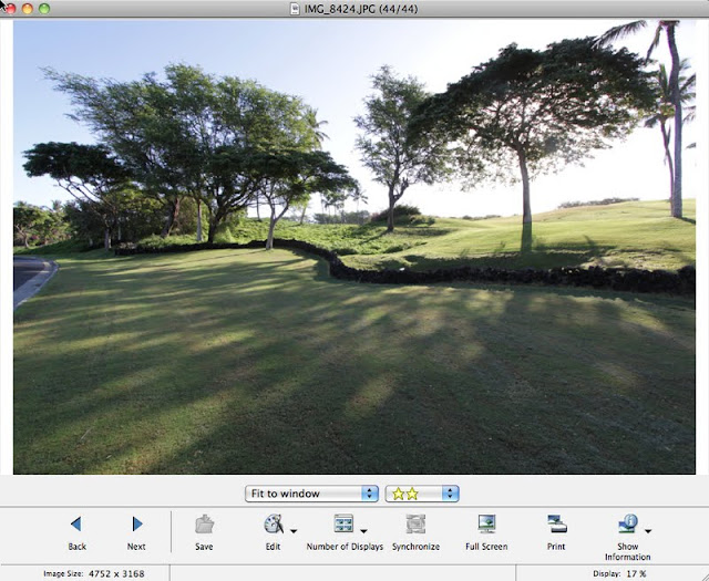
1. Road in Photo - the scene is a golf course
I was interested in the trees


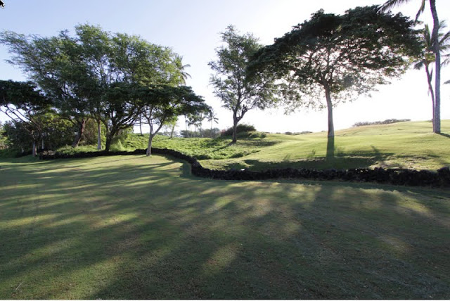
1. I got rid of the road in order to make the image more rural
2. The lawnmower tracks in the foreground still make the image look too urban

1. I increased the darkness by going with the Tone Level Adjustment
I moved the middle small triangular pointer to the right to darken the overall image, which at the same time reduded the number of middle shades (tones)


I decided to darken the image by going with the Curve Function
 I could have tried the Brightness function and darkened the image that way
If some other combination works, then try it.

Just remember not to save the image if it's no good!
Also, always have a duplicate set of photos on an external hard drive as backup!


Your Camera Software-Canon ImageBrowser- Part 1

August 28, 2011

Your Camera Software
Canon Utilities
Canon ImageBrowser
  
    Yesterday, I received a suggestion from a friend in Ireland. He suggested that a good idea would be to write articles more for people  who have "point and shoot" cameras. I thought about it, wrote back to thank him for the idea, and thought to myself "why not?". I hardly ever used my software that came with the camera because I had "fancier" software such as Photoshop for photo editing, and LightRoom (Adobe) and Aperture (Apple) for image organization and also photo editing. So I decided to take a look at what came with my Canon T1i camera, which is a 2 generation older camera from the current Canon T3i. Both are DSLR (Digital Single Lens Reflex) cameras, but I had a nice Canon  "point and shoot" camera that I gave to my wife. That camera also came with Canon software. So, luckily I can try it out and present it to you today.

     I went to check on what model I had, and I couldn't believe how far Canon (and other manufacturer's cameras had since advanced. The model is a Canon A80 PowerShot, and I think I purchased it about 8 years ago. It has 4 megapixels - wow! That certainly seemed like a lot at the time, and I had a 256 MB card to load the images unto it! My wife said that there is something wrong with the screen, so it sits lonely in a drawer somewhere, as she purchased another camera. I'll try and take a look at it.


I find the software by going to applications on my Imac. 
The same will hold true for any PC

I open up the Canon Utilities Folder

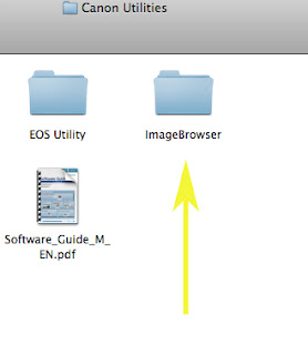
This gives you a whole lot of different folders with different software such as for movies.


Then you click on the ImageBrowser folder


I use a  Sandisk Micromate cardreader to load my photos on to my computer.
This came with an 8 Gb card for my camera, and I prefer it for it's simplicity.Of course, you can use a wire that came with your camera.

1. When you load the photos into your computer, you're asked to create a name for the folder.
The image folders that I took through my camera are on the left.

What's also interesting is that you can use any of your software programs through ImageBrowser.

2. You can have different views  in the Menu Image at the bottom
The above is 1 version

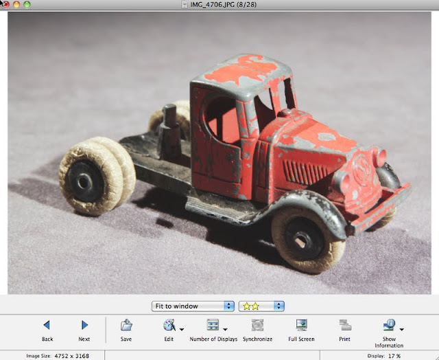
3. This is another view of a single image

  4. You can enlarge the window


5. You can rate your photos in terms of most to least favourite


6. You can see the data when the image was taken


7. You can see which focus setting was used


8. Your image can be viewed on the "full screen" 


The ImageBrowser editing software is at the bottom of the normal viewing window
8. You simply click on the command that you want to work with. 
I chose "trim"
Trim provides you with a fast way to re-size (Crop) your photo. 

9. Here's an example of trim in action


10. Here are the "advanced options"


11. Here is a specific proportion of vertical:horizontal proportion.
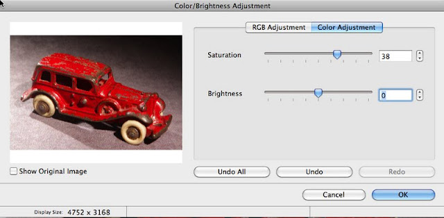
 8. Here is the Color/Brightness Adjustment


9. I've increased the saturation level to make the red stronger
If you move the slider to the left, the image will eventually lose all of its' colour.      


 10. Here is a Color Adjustment
It's RGB
Slide the Red to the Left and you get Cyan (Sky Blue), which is opposite red
Slide the red to the Right and you increase the red

I usually have an unwanted red colour (colourcast) in my photos

                                             And above I've removed the slightly red colour

11. The sharpness command does not work very well!


A "Before" Photo

                                                              An "After" Sharpening Photo.
All this seems to do is add "grain" and "noise".


Thankfully, your reminded if you want to save the photo.
Since the sharpness command is not very good, you simply say no!

12. This is a Curve Adjustment, just like in most software programs
You place your cursor on the line and move the line up or down.
I like to use it to get more shadow detail  and at the same time to give more or less contrast.


                                                  13. Here is how the command window looks


14. Here I moved the graph line up.
Notice how the overall photo got lighter, and now has more detail


15. Here I placed my cursor on the upper part of the graph line and pulled in lower.
This lowered the contrast.

 You sometimes have to experiment with the tone curve command, in order to get a "feel" for this menu.
                                  The same will hold true for the level adjustment below.
            Personally, they're too closely-related, and I sometimes find it easier to use 1 or the other.


 14. Level Adjustments
The "Level Adjustments" menu illustrates the different quantities of dark to light tones in your photo.
The tones are arranged Left (Dark) to Right (Light).
You move the small triangles to the left or right to alter the image.
Moving the small triangles to the left makes tones lighter, while to the right makestones darker.


Above, I moved the mid-tone slider to the left
Notice how the graph (in black) moves to the left to show more middle (mid) tones 


You can also make adjustment by changing the numerical value in the boxes.
Left Box =  Dark tones (Shadows)
Middle Box = Middle tones
Right Box = Bright (Highlight) tones


Photographic Terminology

Colourcast  An undesirable colour that shows throughout the image. It can be from incorrect white-balance of your camera, mixed lights (e.g. using a flash indoors when there are incandescent lights on).
An incandescent light is simply a term for houselights (lightbulbs).