Tuesday, March 27, 2012
Review of Photoshop CS6-
A Huge Discovery!
I made a huge discovery today - both personal and about reviewers and PS6. What I discovered about myself, which I already knew is "not to judge too fast". I mentioned that most reviewers did the "same old, same old" when it came to a review of a new software version. What I wrote is that they took the press release and used that, without actually exploring the software. I mentioned that since most reviewers have so much to do and write, they rarely actually work with the new Beta version.
I was wrong, wrong, and wrong about most! Today, Ididi a search, and decided to go to DPReview. I always went to them for camera and lens reviews, and they did an A1+++ review of whatever camera or lens came their way. I never thought that they also reviewed software. Well, again, I was wrong.
They did a super job discovering many of the new modifications and improvements to Photoshop (CS6), the review was easy to understand. Best of all, I got one of those "Eureka moments", whereby I discovered that Photoshop Beta version improvements are highlighted in blue as you peruse through the many menus.
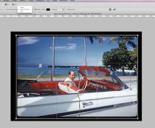
A side-by side view of the new CS6 (left) and the older CS5 on the right

In the new CS6, an entirely new sub-menu appears with more compositional elements for cropping.
The term "compositional element" is simply a way of placing your parts of a photo within the image frame (24mm x 36mm - full frame) to make the photo more interesting.
I already started an instalment on Composition with the "rule-of-thirds", and will introduce more elements in future instalments.

In the old CS6, all you had for selection when you used the cropping L's was:
None
Rule of Thirds
Grid
The above image is a photo of my late father Carl- a fine man who raised 4 children.
The photo was taken by late fine mother Ida, circa 1950's when they went to Florida for a week in the summer. The rest of the year, they literally killed themselves working in a successful, but almost no-rest year.
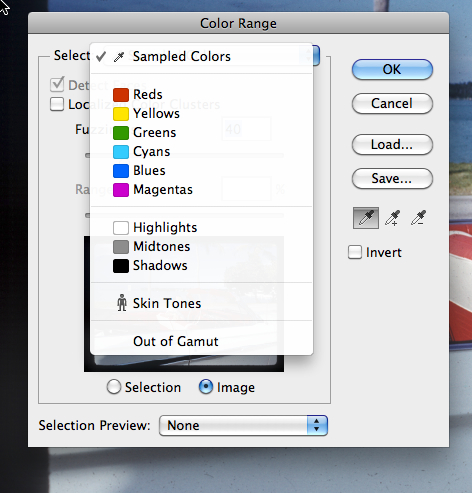
Notice the "color range" highlighted in blue. That informs you that this has a new feature
When I select "color range", notice at almost the bottom of the window menu that there is
a man figure with the words "Skin Tones".
This new feature allow you to select skin tones from the photo, which then you will be able to adjust to more natural coloration with another menu.
Here is another screen capture in PS6 which illustrates in highlighted blue the new features.

A side-by side view of the new CS6 (left) and the older CS5 on the right

In the new CS6, an entirely new sub-menu appears with more compositional elements for cropping.
The term "compositional element" is simply a way of placing your parts of a photo within the image frame (24mm x 36mm - full frame) to make the photo more interesting.
I already started an instalment on Composition with the "rule-of-thirds", and will introduce more elements in future instalments.

In the old CS6, all you had for selection when you used the cropping L's was:
None
Rule of Thirds
Grid


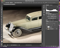
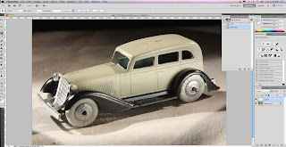
A side-by side view of the new CS6 (left) and the older CS5 on the right
Notice a subtle change to the menu.
I discovered that you can make the image and current menus (on the right) smaller all at the same time!
The above is an actual smaller screen capture from the new CS6.
To reduce everything in size, you simply grab the lower right corner of the menus, and move then inwards.
This makes the entire viewing (photo and menus) small all at once.
Before, you could only reduce the image size by grabbing the image and moving inwards.
This feature was great when I had both versions of Photoshop running on my computer!
For myself, this is a super, super new feature!
Why? Whenever I need to look for a file on my desktop, Photoshop is blocking the window. I normally place Photoshop on the bottom in my OS, but now by simply shrinking everything, I can access my desktop file icons while still having PS6 open on the screen!
To Be Continued.....



No comments:
Post a Comment