Tuesday, November 22, 2011

Image-Editing Software: The Histogram

Tuesday, November 22, 2011


Image-Editing Software:
The Histogram

     I thought that I'd start to explain about the  different  parts of every image-editing software, so you could better and easier understand the term. I'm going to start with the histogram. A histogram is a graph-like presentation of how the different shades/tones/colours are proportioned in a photo. THis sounds complicated, but you'll get to understand this, once I show you some photos.

Placement of the Tones
Left side: Dark tones (shades)
Middle: (middle tones)
Right side (Light tones (shades)


This histogram shows that:
1. There are lots of dark tones
2. Lots of light tones
3. Not too many mid-tones

This histogram shows that:
1. There are  all kinds of tonal distribution, but mostly
2. Lots of midtones
3. Some light tones


This histogram shows that:
1. There are  mostly very dark tones
2. Hardly any mid-tones
3. No highlights

* The vertical levels simply indicate the quantity of the toones
while the left to right spread (horizontal) indicates the actual tones 
(Black-greys-whites and eerything in-between)


To correct "problems" that are shown by the histogram, 
you can use the "levels" menu.
This menu also has a graph to show you the distribution of tones.
The left and right sides and arrows are the same as with the histogram.
Left = black
middle = mid-tones
Right = white


You simply slide the pointers  or arrow heads in the top "input levels"
to change the image tones. 
Of course, you can alter the numbers, once you understand the numerical system.

I changed the "arrows" and improved the photo.
However, as you can see, there are not enough quantities of tones (vertical axis) in the graph.


I worked with the arrows/sliders and got the above.
The photo lacks enough contrast, but the tonal distribution 
is much better in terms of quantity. 


I was working with the program Compositor, 
so I don;t have full mastery (understanding) of the program.

I decided the select the highlight areas with the lasso,
and then lower their exposure (make them darker). 


This made the histogram more like a rounded hill.
The "rounded hill" shape is best.
When the quantities appear to hit the top of the rectangle, that indicates that their more than you need of them.
You want the quantities to go below the top!


More adjustments (darker) have
let to a better "rounded hill".


The Invert Selection command simply changes what was selected.
Before I selected the lighter tones (sky and water).
With the Invert Selection command, I've now selected
the land areas.


The histogram hasen't changed much, but there is better detail in the shadows (dark areas).

So the question you're probably asking is why bother with e histogram, when you can simply work with the menus such as: 
Levels 
Highlights/Shadows
Curves
Exposure

The answer is that it's a tool amongst many others to assist you in improving your image.
Here's an analogy that perhaps can explain the "why".

An experienced car mechanic can tune a car by experience and feeling without using machines to show him/her a visual "picture" of the tuning.

Of course, the "picture" is the oscilloscope (or whatever the tuner is called) and this is like the "histogram" in an image-eiditing software.

Eventually you don;t need the "picture", but it helps at the beginning, especially when it comes to "hitting the ceiling" with the tones.


As usual, I welcome any comments or corrections or suggestions.
So if you don't understand something, or I erred, please inform me, and I'll correct or alter the instalment writing to better clarify the topic.

SB 


Sunday, November 20, 2011

Compositor - Not Your Every Other Image-Editing Software

Sunday, November 20, 2011

Compositor - Not Your Every Other Image-Editing Software


Part 1
     I've been presenting to my readers program reviews that are almost all image-editing software and for Mac. I've been debating whether to purchase a 27" monitor for my PC. My PC is about 5 years old now, but works quite well, all things considered. However, I've been spoiled on my Mac, but for the 5-10 times a week that it seems to crash for no reason at all. But the "crashes" are only when I'm on the Net.
I'm spoiled because of the screen size. 

     Personally, I never found the Mac to be that much better than a PC. And when Apple finally had to go with Intel chips, all the peacock-strutting by Apple about the speed of a Mac went out the door. I don't find the Mac all that better, especially when you consider the financial premium that you pay to have one! However, I'm getting off track. Anyway, I might just start reviewing PC programs for there certainly are many more out there for PCs.

   To get back on the topic, I found Compositor on the Apple Software page. There are a few software programs that seem to use the Apple software for their  main site after searches are done. You can eventually find the Compositor site after some research.

   Compositor is an image-editing software, and it was created by 1 person. If I'm wrong, someone please correct me.  I'll do more research later in the week to clarify and elaborate on this. This program is relatively inexpensive, priced at $39.00 U.S. But what's more interesting is that it has certain "quirks" that make it perform differently, hence my title.  Certain tools don't quite perform like other programs, and certain other tools perform unbelievably! It makes you wonder why the "other" program doesn't function like this.  You'll see what I 'm saying later in the week, but for today, I'll show you the rubber stamp-wow!

** I will need more time to work with this program, 
so please return as I expand on this instalment. **

 The Compositor Logo


The Opening Window
The opening window certainly looks like other programs, but its' colour palette is presented differently.
That's our wonderful dog Buddie - a Poodle.
He's the best companion (I don't like to call him a pet) that Heidi and I have ever had!


I used levels to brighten up  Buddy.
So far, everything in the program works "normally" in term of a comparison to other programs.

Then I came across this small window.
What you do is take "snapshots" of a the latest window of an image that you're working with.
You then can later press the photo and go back to whichever one you pressed.

It's like the history menu, but you have a "visual record" of the progress of your working image.

Clever and ingenious!

 I was looking for "automatic colour correction", but I either haven't found it yet or it doesn't exist.
If you're a PDE person (pre-digital era), then you know all about colour, colour filters, colour correction, colour conversion etc. This sounds like Bubba in the Forest Gump Movie with his many shrimp recipes!

Anyway, you'll begin to learn about correcting colour the old-fashiopned way. That is, by actually using the opposite colour to correct the wrong colour in an image.

In Buddy's photo, I added cyan (or removed red), and added some blue (or removed some yellow).

What I'm not crazy about is that any change in colour will only be shown in the small photo!
It's too small for me!
Perhaps, there a command to enlarge this window, and I'll discover it later.

Here's another image that I used to write an article.
The article was about the relative different sizes of old cast iron cars.

When you open up an image,and especially a large image in Compositor, the image is very large.
It took me a second use of the program to figure out how to reduce the image size on the screen.

Different, but that's OK. 
I like to see some "quirks" in a program.


I was spotting some small spots with the rubber stamp when I accidentally discovered the 
wonderful "touch" and control of this tool in Compositor.

I removed the large black Hubley car from the above image.

The rubber stamp has the "usual" size and hardness  controls. 
It also has "spread" which I'll need to work with. 

When you press the option key, the small triangle of the source for the rubber stamp
points to the source and is white.


When you release the option key,, the small triangle of the source for the rubber stamp
points to the source, and is black.

What's interesting is the ease with which to work with Compositor's rubber stamp!


I got carried away, and decided to do some fast retouching on the Hubley cast iron racer.

I "messed up" on the tail fin where you can notice the softness.
However, I was able to retouch the rest of the scratches in no time at all and with very little effort.
By that I mean not having to reconfigure the settings of the rubber stamp.


Part 2
   ( Tuesday, November 22, 2011)


     I got busy withy E-Bay, so I didn't work on this instalment since Sunday. First E-Bay offered  free 1500 listings (does anyone have that many or the time to add them?), then they added a 1 cent/ listing yesterday (does anyone have any items to list after the 1500?).

   So I'm just expanding on Compositor today. What I like about it, is that is different. Like some of the other image-editing programs that I've written about, it has similar functions like "The One", however, it has lots of its' own unique features and design elements.

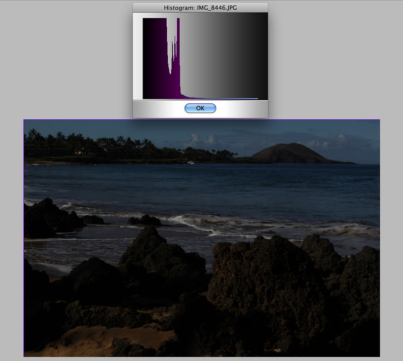
Herre's one of my photos from Hawaii

Here's the histogram of the image.
I really like the design presentation of the histogram!

A "histogram" is simply a visual presentation of the range of tones from black to white everything in-between.

What the histogram above shows:
 1.  The dark tones (left) are missing detail (the graph should go to the left vertical side)
2. The light tones are too dark (the graph should go to the right vertical side).


Here's the "normal" histogram that all other softwares have.

Here's the improved image.
I pulled the pointers to the left and right verticals to improve on the  dark ares at both ends (darks were too dark  with loss of detail, and the light tones were also too dark, without enough lighter tones).

Here is the "snapshot window).
You can always undo the previous command or simply go back to the original window.


OK, enough of the regular command to improve the image to "normal".
Let's try a few "enhancement" and artistic functions.

One of the filters to enhance the image 


I liked this one.
Hawaii was built up millions of years ago from volcanoes.
In parts, it's very desert-like and "alient".
Sure enough, there was the filter above" that by happenstance, I found.
I placed a small "saturn" into the upper right corner.

Here's a "Multi" command
I didn't know what that was, so I pressed it.

I got this 4-image duplication 
Great for when you need to make multiple photos of a baby's Christening or a newborn baby to send to all of the relatives (a real old-fashioned paper print!).

To be Continued......


Friday, November 18, 2011

Cleaning Up the Background and Foreground

Friday, November 18, 2011


Cleaning up the Background and Foreground

     There are many listings on e-Bay whose photos are distracting and busy. The background has other items in the photo or what the item is resting on is also distracting. Nevertheless, these items sell. However, with an extra 10 minutes, you can clean up the image to make the item for sale more attractive. The item below is a listing of mine - a 6" long Hubley Cast Iron Toy. It's nice but slightly distracting.

I used Fluid Mask 3 (by Vertus) to create the selection patterns.

You have the  choice either to use the red brush (to remove), or the green brush (to keep portions of the image. I changed the red circle (remove) for the green (keep) brush (below).

The green will be the portion of the photo that remains

After you've brushed the keep areas, you use this tool (mask) 
to keep what you selected,and remove the rest.


Here's the result. After you say "OK", Fluid Mask 3, which is a Photoshop plugin, closes down.
You then continue your work in Photoshop.
I wasn't 100% on the selection, because I knew that I could use the Photoshop eraser to remove the rest easily and speedily.

I then used Photoshop's magnetic lasso to separate the unnecessary parts to be discarded from the
actual Hubley truck.

The next step is to create what is called a gradient.
A "gradient" is a subtle change in a similar set of colours or tones form light to dark.
The squared selection on the left is the gradient button.

Now you add a duplicate layer to work with.

Creating the Duplicate Layer

The Duplicate layer to work in.

The Result.
Theres some "distractions" that I missed about 2" above the roof of the truck. 
They appear as smudges on a computer screen. I'll clean then up later.


Flatten the 2 layers to one.

Now there's only 1 layer

The final result.
I also cleaned up some distraction in the background that wasn't seen when I had originally removed the distracting areas in the photo.

I'm sure you'll agree that this photo is much more presentable and that it focuses your attention on the truck more now than before.

  We can be "a little fancier" by adding a shadow and then adding both the shadow and the truck to a gradation. It's a lot more work, but I'll show you anyway.

Here's the truck file again

I'm going to add what is called a "drop shadow" in Photoshop


Here's how the "drop shadow" selection looks in the layers window

This is the control window for adjusting the shadow
I'll leave it up to you to play around with the parameters

Here is the effect
I've added a white background, otherwise against the checkered background, 
you would not see the shadow. Also, I wasn;t able to just select all and then paste the truck and shadow in the other file of the gradient (below).

Here is a gradient that I made.

Start with a new file, and make it  bigger in size than the truck and shadow.
You want to leave space around the truck and maneuver it to your liking.
I like to position it at 1/3 from the bottom (please see later).

The file will look empty until you create the gradient.
The darkened icon above is the gradient tool

A cross appears, and what you do is drag the cross from the top to the bottom.
You can also drag the cross in any angle that you want.

Here's the gradient again

Here's the Fire Truck and Its' Shadow

I need to Isolate it from the white background.
I know you probably think why the extra step.
Thuis is how Photoshop works!


You sample the tones or colors with the eyedropper.
Each time you use the + eyedropper, it expands the areas of selection.

It's easier to select white than all of the different tones of the fire truck and its' shadow.
Once I've selected the whites, I can "invert" the selection. This will capture the truck and shadow.

One of the controls is the border selection.
The larger the number, the more it moves inwards of the "inverse" selection".
I chose  22 for the pixel width (above).

Here's the final result.
The white outline around the shadow is an error!
I don't know what I did wrong, but I'll be working to correct that!