Thursday, December 1, 2011

Making Your Photos More Interesting

Friday, December 2, 2011

Making your Photos More Interesting

     Right now, most of my photography is for e-Bay. I then take the photos and talk either about old toys, or for this blog, learning more about photography, and taking better photos.

    I was photographing a new group of toys, when I decided to talk about making photos a bit more interesting. So let's get straight into this episode. I'll be talking mostly about using items for reference size, and stronger lighting.

My Typical E-Bay Composite Photo.
A composite photo, for those who may not be familiar with the term,
simply means a photo made up of several photos.

The gray fabric was used as a neutral tone. 

My Slightly-Better Photo for E-Bay.
I bought a few new fabrics, and the American 1 cent coin is placed in the photo
for size reference.

For this photo, I decided to use my IMac keyboard.
Everyone certainly knows the approximate size of the keys and keyboard, so why not use this as an ABS.

I invented the term ABS which is an acronym for "anything but seamless"
Seamless paper are the long rolls  4' x 36' (1.2M x 10.5M) that photographer use for
catalogue photography. The paper is 1 length and when you make a slight bend in it, creates a sense of infinite depth, since there is no corner or edge to tell the viewer where the back ends.


Filling the background with other toys helps to make the photo more interesting.
However, I controlled the light and used a shallow lens opening (f 5.6).
That combination helped to keep the centre-of-attention on the truck and cab, which are are the items being sold on E-Bay.


How about modifying the light?
In the above example, I took my IKEA pen holder and placed it in front of the light.
Since I use small spot lights which cast harsh shadows, I was able to create that mesh-like pattern.
Any item (a coloured glass bottle, a piece of cardboard with a pattern, and so forth will work as well. 


You can see the IKEA pen holder in the upper left corner.


These are small magnets about 1 1/2" in diameter (4 cm).
That conversion from Imperial (American) to Metric certainly keeps my brain active!


A pair of sport sunglasses.
THe red/blue colour theme works well, the glasses remove some empty space (the fabric), and the sunglasses act as a reference to the size of the toy.


Another variation of the Sunglasses.
Once you are photographing something, why not try as many variations as you can before you "get tired" of using the item.
By the way, the glasses in photography are called a "prop".
A "prop" is simply an accessory item in a photograph that makes the photo more interesting, but does not distract from the main item. In this case, the main item is the toy Tootsietoy car.


And 1 final photo for this instalment.
The diameter of the DVD is 4 11/16" or 120 mm.
I can certainly see why metric in this measurement certainly is the best system for measurement of a DVD!

I would like to thank all of you for visiting this new site.
My readership is starting to escalate to roughly about 20 page views/day.
I still can't figure out if that's 20 people viewing this site, or 1 person reading 20 pages!
In any case, I appreciate all of you for dropping by!

Thank you!


You'll have noticed that I changed the font size and colour.
A viewer, and  my wife mentioned reading the material was hard on the eyes.

As a result, I've enlarged the size of the font, and changed the colour from red to white. 

Any Comments?


Photoshop - The Rubber Stamp

Thursday, December 1, 2011


The Rubber Stamp
(Photoshop)

     Many of the names of  tools in programs like Photoshop (Image-editing software) derive from either old photographic terms (burn, dodge, contrast) or from tools (rubber stamp, brush). One of the more functional tools is the rubber stamp. Basically you select an area to take your sample from, then place the stamp over the area needing "repairs" and click the mouse. You can do anything that you can imagine, and all it takes is some practise.

The Starting Image
A Dinky Toy


I "auto-coloured" the image

The 3 areas that I would correct

The Rubber Stamp Tool
It's located on the left side of the Photoshop Window
You can put this small tool window elsewhere.


In Photoshop )and other softwares),when you click on a tool, 
the adjustments will appear on the horizontal top menu. 

Here are some of the adjustments:
1. Size
2. Hardness: do you want soft edges or well-defined (hard) edges


Opacity simply means this:
Do you want the rubber stamp to completely cover over the distraction, 
or simply to blend, and show the underlying area you are about to cover?

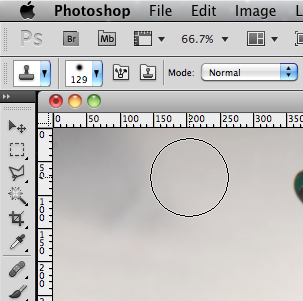
Press the arrow pointing downwards of the horizontal menu,
and you'll be given a whole slew of choices.
Dont' worry - I never really use more than 2, but the choices are there.
When you have a product that's # 1, you continually have to revise it!

"Flow" simply means how thick you want to apply the retouching (rubber stamp).
A low-percent flow would be similar to how paint is applied to repainting a car.
You "blend" the paint with a spray gun by going back and forth with a fine mist.
A high-percent flow would be when you're spraying a barn - the finish does not have to be as "super" as the finish of a car. It just needs a "fresh coat of paint".

When you click on the mouse, a target shows up. 
That is where you will be taking the "sample" to paint over the area that you don't like.
In the above photo, it's the shadow or dirty material in the upper left of the truck picture.
I didn't select the shade of beige properly, so the shadow is becoming too light, compared to its' surrounding area. In the picture above this one, you can see the sample is too light.


So I reselected a lighter tone, and repainted over "my mistake".


As you can see, I took a sample close to the shadow.


The next task is to remove the penny.
I'd only remove it for an article whereby people already were familiar with the size of the toy.

The penny disappears!

The red cord is the next distraction.
For selling on E-Bay, I'd leave it.
For a book, I'd research the cord, and then add fresh cord, hemp or whatever, 
along with a  replacement hook.

I'm starting off with a much smaller brush than my first "shadow removal" task.
Also the 'hardness" is softer.


I need to readjust the rubber stamp adjustments.
Because I'm working in a smaller area that is more-defined (sharper edges), 
I will make the rubber stamp smaller, and soften the brush hardness.
Notice that the size has been reduced from 72 px (Pixels) to 39 px.

You can see here the confined area that I have to work in.
You can where I'm taking samples to cover the orange fibers of the cord.

I need to create a straight-edge for where the cord is to "disappear".
The reason is that my hand is not steady enough to create a straight-edge.

I'll select the "selection tool" which is the dotted rectangular symbol on the above left.

This was done by "free hand".
The edge is ragged, and will show when I show the whole toy.


Here's the selection tool added to the area needing a straight edge

Here's the area with having used the rubber stamp .
Having the selection (dotted line) there, I can only rubber stamp along the edge and inside the rectangle.
Hence, I get the perfect straight edge!

When I'm finished in that area, I will deselect the selection tool.


Here's the finished result

Here is some work that I did where the words "Dinky Service" are.
I also did the roof near the passenger door.


Here's a close up of the roof

 Being in the DE (Digital Era) is unbelievable.

You don't need to spend let's say $100.00 for the perfect Dinky Toy tow truck to show the "perfect Dinky Toy". All you have to do is use any image-editing software to do the work. In the beginning, you'll make mistakes, but as you practice more and more, you'll get better and faster.

Personally, I find this type of work relaxing, but then again, this isn't for everybody!
I remember when Photoshop first came out and I was teaching.
Some students made extra money retouching for others who didn't like the tedious work!


Monday, November 28, 2011

Colour and Exposure Accuracy in Digital Photography

Monday, November 28, 2011

Colour and Exposure Accuracy in Digital Photography

     One of Heidi and I's friends came over today for a short visit. Peggy-Anne and her Husband Glenn are architects, and Peggy-Anne has become a super artist. They say that one should change your profession 5 x during your lifetime. I have trouble with 1! Heidi, Peggy-Anne, and myself were talking and  Peggy-Anne said that she's arranged with a company to sell her beautiful artwork. Peggy-Anne   started to talk about accuracy in reproducing colour, and the next thing I knew, I was talking to her about about colour charts and gray scales.  Of course, if she started to talk architectural language, I would have trouble understanding. So I got one of those "Eureka moments", and I therefore said, that I'd simply write an instalment about this on my blog.

    I also received a new group of nice toys from someone in Maine (Larry Jacques) whom I'm trying to coax into writing an instalment. He also restores toys, and his batch of toys were used today for thios instalment. Thanks Larry!

    In the BDE (Before Digital Era), you had to have certain films to match the light that you were working with. They only made daylight and tungsten films. You used daylight for outdoors, and tungsten for most warm-light (lightbulbs) photos. There were also a range of colour filters to get accurate colour.  I don't want to go too much into detail, but here's an example when having used slide film. Unlike negative film where you could "correct colour" in the darkroom or at your favourite photo store or lab, slides recorded the image and you couldn't do any changing. Daylight slide film was fine for shooting between 10:00 - 4:00 P.M. on a bright sunny day. However on an overcast (cloudy day), you'd end up with blue-coloured slides. What you had to do is place a warming filter over the lens which was reddish in colour.

  Today in the DE (Digital era), you simply choose the white-balance on your camera to match the light source that you are photographing under. There are also special  colour charts and gray-shaded charts to use for accuracy when you need it. You can use Photoshop to adjust colour based on Photoshop readings of the colour or gray charts.

  One of the more popular and successful companies is X-Rite, which produces the Macbeth line of these special calibration charts.


 Here is the ColorChecker Brohcure and Instructions


 # 19 is white and is used to check for colour accuracy and calibration.

 Here are the chart values

Here are the exact values for this # 19 white tone

To explain colour in photography, you need to know that white is made up of equal colour values  or quantities of  RGB (Red, Green, Blue). The "opposite colours" are CMY (Cyan Magenta and Yellow).

In a perfect setting ,the values would be equal. However, if your lightbulb is older, or you're in a green-walled room, the ideal world is gone right away!

An ideal set of values for white are 
R 243
G 243
B 242 
(* I don't know why B is 1 # less)

In a green walled room, your numbers might be:

R 200
G 250
B 200

There is more green hence the higher number.
You find these numerical values in Photoshop, which I'll explain below.

Before you adjust the colour, you need to determine accurate exposure.
Above are a range of underexposed and overexposed test photos.

I should have placed the colour chart in there, and then read the
# 22 gray value in Photoshop.
Gray is used as a reference as it has no colour in it).

Here's the X-Rite ColorChecker, with only 3 exposures.

Here's the X-Rite White-Balance Card with only 3 exposures.

Here's the X-Rite Gray Scale Balance Card

All 3 can be used together, or you can purchase just one.
Any of them will give you numerical values to change (if needed) in Photoshop or any other image-editing software to obtain more accurate values and colour.

The item above is called an "eyedropper".
It is used to measure colour in a photo in Photoshop


In the upper right corner of Photoshop is the colour centre.
looking at the numbers and comparing them to the X-Rite values,
shows you that in my photo,
I have more red and magenta than blue.
If I remove quantities of these, then the photo won't be so "reddish".

 I changed the values elsewhere in Photoshop, and the above is what I got.
Notice that the background is not as red as before.

You can go to the X-rite Photo site to get more information and assistance.


I used the eyedropper to get a reading of the gray shade.

Here are the gray values.
The 3 values are certainly almost equal, so the grey will appear grey.


Here's the values for white and they certainly are within what they should be.

My problem is that my fabric that I use to photography my toys is reddish.
Even though the X-Rite reads accurately when I corrected my numbers in Photoshop, the fabric is
not a pure grey.

So I'll have to live with that or get another fabric.

I'll be coming back to expand on this instalment, but for now, let me review.

1. There are special "targets" that can be added to a photo in order to  get accurate colour.

2. These targets have specific numerical values.

3. These values can be read in most image-editing software programs.

4. White values are high as they reflect more light to the camera (250-250-250).

5. A mid-grey value is best for determining accurate exposure. Its' value is 160-160-160.
I got these numbers in the image above called "chart values).

6.  A black value is the lowest of all and reads 52-52-52.

7. If your numbers are "off", then you know that the true photo colour is inaccurate.
If it read, lets' say 270-250-250 for "white,then you'd know there is too much red in the photo.

You would have to subtract 20 units to get the accurate colour and numerical values.


To Be Continued........